Graphs of the DHW system
I wrote an own program to read the control's sensor data, and upload it to the WWW. You can see two curves if my laptop is switched on - usually it is when the weather is good enough that I can expect to get some informative data, there's no reason to let the computer run for nothing worth looking at...
|
Result
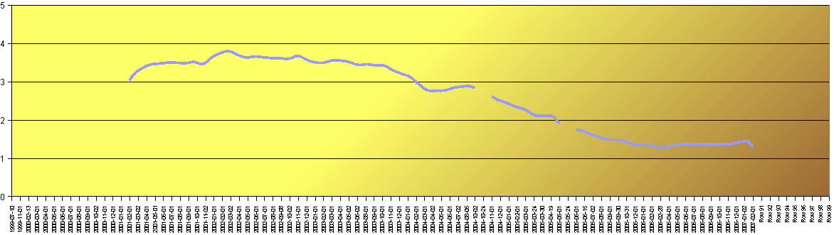
The following graph shows how much the oil consumption went down. In addition to the DHW system, we bought a stove that we use as additional heating. The graph shows- The effects of the stove, bought in August 2004
- And the DHW system, installed at the end of march in 2004
Monthly results

Oil consumption graph
Monthly results (gliding mean value)
Oil consumption graph